Hi, I'm Torrey. Welcome to Left Field, where creativity runs amok and imagination is ALWAYS more important than knowledge. Shoes are not allowed but ties are optional. This is a repository of snippets from my life out here in Left Field. One never knows what shiny bits of creativity will be found here... cards, scrapbook layouts, photography, poetry, recipes, ponderings, rantings and musings. It could be anything! Life in Left Field is always changing, always real, always ...interesting.

September 30, 2012

Big Happenings at Kenny K!

Today over at Kenny K's Krafty Krew we have TWO FaBuLoUs events coinciding...it's sort of like crafting planetary alignment! Well, kinda.
First up is that Kenny K Downloads is having a SALE!!!

 
For just one week you can get a Whopping
30% off all Digital Stamps with this 

 coupon code: PREHOLI

So now's the perfect time to hop, skip, jump or RUN over and grab some bargains.

Second event is a Give-Away!!! 
 10 Brand New followers will win 5 Digi Stamps each from Kenny K Downloads and all you have to do for your chance to win is follow the Kenny K's Krafty Krew  blog and leave a link to your blog in the linky. Besides, you KNOW you've been dying to become a follower anyway!!!


The 10 winners will be picked at random and announced on Sunday, October 14th, 2012 on the Kenny K's Krafty Krew blog!
Good Luck Everyone!!!

September 28, 2012

It's Not Easy Being Green

Hi everyone out there in blog land. Today's offering is a group of photos I shot as I was leaving the house to mail off a package. We share our house with a very large family of Anoles. Anoles are tiny little lizards that have the ability to change color depending on their surroundings. For this reason, they're often confused with or called "chameleons" but they are NOT chameleons. Nor are they geckos. Actually, they're related to iguanas. They grow to be about 5-7 inches from nose to tail tip. They are harmless. Actually, they're more than that...They're very beneficial as they eat all manner of bugs and spiders. If it's a bug that's small enough  to fit in his mouth...he'll eat it.

I just love these little guys! They're so cute and right now we have about 8 of them living behind the window shutters and under the Soffit by the front door. Occasionally we catch them sunning themselves on the hedges out front, but if they see us coming...ZIP...they disappear. This gal, however, was not afraid of me. You can tell she's a rebel right off, because she didn't try to blend into the brick behind her. In fact, she was quite curious and maintained eye contact with me while I gingerly inched my camera lens towards her until I could almost touch her nose. She is a BEAUTIFUL vivid green with a hint of turquoise around her eyes and little orange/terracotta flecks scattered all over her head and the center of her back. This little gal was about 5 inches long. I refer to her as a "she" because it is a "she". Female anoles have a stripe that runs down their back...males don't. Females also have a much blunter nose. Males have very pointy noses.

I can't seem to shake this odd urge to switch to Geico.


September 25, 2012

Hoppin' For "The Girls"

It's the last Wednesday of the month!!!  That means...(drum roll)...that it's 
time for the
Our hoptress (that's hop+mistress), Alison, decided since last month's theme was all about the guys...that this month, in all fairness, should be all about 
THE GIRLS...
And, since October is fast-approaching, and October is also  
we were tasked to come up with a project that is PINK and dedicated to the preservation of THE GIRLS...you know...THE GIRLS--also known as: 
(in alphabetical order no less)
  • Bazookas
  • Bomb Shells (I'm not making that up)
  • Boobs/Boobies
  • Breastages
  • Cans
  • Chest-ticles (my fave)
  • Headlights
  • Hood Ornaments (I sense a car theme here)
  • Hooters
  • Hypno Globes
  • Jugs
  • Knockers
  • Maracas
  • Milkshakes
  • Money Makers
  • Rack
  • Tah Tahs
  • The Girls
  • Watermelons (or in my case...grapes--well, more like raisins now)
Aren't you impressed that I know so many euphemistic terms for mammary glands? 

(just humor me and nod)

It's a gift. 

Breast Cancer Awareness is something that is very near and dear to my heart. See, every woman in my family on my mom's side (back 5 generations) has had either breast cancer, ovarian cancer...or both. This includes my mom and my grandmother...my aunts, great-aunts, second cousins...you get the picture. Those of us in my generation are holding our breaths and crossing our fingers that we will break this terrible trend. 

It is SO vitally important to do self-exams and get regular mammograms. I cannot stress this enough. I also think it's a good idea to get genetic screening for BrCa1 and BrCa2 (though my mom was negative for both and still ended up with breast Ca). I'm happy to report that both my mom and grandmother survived breast Ca...mainly because it was caught EARLY. So, I IMPLORE all of you ladies out there to take care of your Chest-ticles. 


That said, if you hopped over here from Glittery Katie's totally Fab blog (isn't she awesome?) then you landed in the right place. Here are my entries. Yes, plural. I made 3. One for each boob and an extra just because I can. What can I say...I was inspired.

For the first one, I used our beloved Bombshell Angel...but for this challenge...I, um...altered her. A lot... Photoshop is my friend. How many changes can you see in her?

Fight Like A Girl

A closer look:

************************
My second offering today is this tit-illating card. We're heading back to the Old West where women were strong and proud! What? They didn't have implants back then? Oh well. deal with it.

Here's a crafty tip...I wanted to put star brads on here, but I only had silver ones. That wouldn't do at ALL. So I whipped out my hot pink permanent marker and colored both them and the staples so they'd match. 

CRAFTY HINT: remove the chunk o' staples from your stapler and color just a few, then drop 'em back into your stapler...this is a WHOLE LOT easier than trying to color them AFTER you've stapled them..just sayin'.

They're FAKE

************************
Since my first two projects centered around the after-effects of cancer...I decided I better make a preventative card--just to balance things out.  For my last card I went a little (okay a LOT) wicked. But hey...you GOTTA maintain a sense of humor.  

Breast Exam

Thank you for hopping by and looking at my projects!


Next stop is Emily's  Tah-Tah-rific blog. Be sure to leave comments along the way to show your love and support. Then, enter YOUR project on the Bombshell Blog for a chance to win some super FAB prizes!!! 
Here is a complete list of the talented ladies who are participating in this hop!!

 Alison 
 Kelli 
 Alaine 
 Glittery Katie
You are here... Torrey...You are here
 Emily 
 Lizzie 
 Jodi 
 Jenn 
 Kim 
 Rachael 
 Susie 
Kathi 

Ingredients:
Bombshell Angel stamp (pin-up girl)- Bombshell Stamps
Fun 'n Flirty Bombshell digi stamps (off-the-shoulder shirt)- Bombshell Stamps
Retro Cowgirls stamps (cowgirl, barbed wire and gun)- Bombshell Stamps
Wanted poster digi stamp - Bombshell Stamps
Cherry Bomb stamps (devil)- Bombshell Stamps
Butterfly Queen stamps (pin-up girl) - Bombshell Stamps
Nestability Dies - Spellbinders (Lacey Oval, Lg Scalloped Rectangle)
Prismacolor Colored Pencils 
scallop border punch - Martha Stewart for EK Success
star brads - Creative Impressions
Patterned Paper - KI Memories, Heidi Grace, The Paper Studio, Colorbok, Anna Griffin
Ribbon and flower trim - Michaels
rhinestones - Recollections
doily
cardstock

I am entering one, some or all of these cards in the following challenges:

September 23, 2012

Fruitastic

Hidy Ho! It's Sunday, Sunday, SUNDAY, so that means it's time for another challenge over at  
This week our theme is
"Hey Fruity"
Don't ask me...I just work here. But, for today's challenge, make whatever suits your fruity fancy as long as it's got fruit on it somewhere, or has fruity colors. Come play along for your chance to win some super prizes!!

Our first sponsor this week is our own 


The prize from Kenny is the winner's choice of 5 digis.

And our second sponsor is


who doesn't LoVe ribbons? Iknowright?


I got a little silly with my project. Looking at it now, I'm wondering if I'm gonna ruffle some feathers out there. This was not my intent. I just wanted it to be a HAPPY, SILLY card. So, PLEASE...don't leave comments about how I'm making fun of people with disabilities or stereotyping people of color with regard to having an affinity for large ovoid fruits. Thank you! (hee hee hee). 

That said, I used this really cute "Tug Of War" digi stamp from Kenny K. It has SO MANY possibilities as to what could be at the other end of that rope. For today's card, it is a giant, genetically-enhanced watermelon--somehow a cantaloupe just would NOT have worked (besides, I don't know how to draw a cantaloupe). I figure when these boys are finished with it...they can use it as a canoe! And FYI...I did a little magic in Photoshop and added the additional ropes around that ginormous melon...because one tiny rope at the bottom didn't seem...adequate for the job.

I'm entering this card in the following challenges:
Paper Crafting Journey: My Sentiment Exactly
Creative Craft Challenges2: Anything Goes
Divas By Design: #53 Lovely Layers
Chocolate, Coffee & Cards: Sweet Treats

Ingredients:
digi stamp - Kenny K (Tug Of War)
Nestability die - Spellbinders (Deckle Oval)
Prismacolor Colored Pencils
mini brads - Creative Impressions
patterned paper - Heidi Grace and some old stuff in my stash
mini rick rack 
deckle scissors - Fiskars
marker - Zig
cardstock


September 18, 2012

Arrrrrrr

Ahoy thar! Raise th' colors, me hearties...fer t'morrow be "Parlay Like A Scurvy Pirate Day"!!! Over yar at Bombshell Stamps, we be havin' a marrrrrr-velous parrrty!! We be craftin' up a bevvy o' scurvy pirate-y beauties fer ye to feast yer eyes on.
So, hoist the mizzen and swab th' decks and head on over to th'
to take a gander at th' booty we done prepared for ye!!

Here be me creation. Not much needs to be said 'bout t'is scurvy pirate beauty--'cept she be colored up all in them browny-sepia tones, 'n I crafted her a peg leg o' me own design. th' rest kinda speaks fer itself, don't ye think? Aye, lassy! Fer 'tis auspicious-like occasion, I even created a wee ditty fer ye to be off along wit' th' carrrrrrrd...it goes like 'tis:

There once was a Pirate named Sue
She commanded a very large crew.
She was buxom and leggy,
but now she's called Peggy...
'cuz a shark ate her leg for fondue. 


I'd like to enter 'tis carrrrrd in th' followin' challenges, matey:

Ingredients:
Pirate, hat, and treasure chest stamps - Bombshell Stamps (A Pirate's Life, Mermaid Treasure)
Wanted Poster digi stamp - Bombshell Stamps 
woodgrain embossing folder - Sizzix
Nestability die and banner die - Spellbinders (deckle oval)
Prismacolor Colored Pencils
antique brads - Creative Impressions
patterned paper
cardstock
gold leafing pen - Krylon


September 16, 2012

Animal Instinct

Greetings and Salutationy things,

Today's project marks my last as a guest designer for Corrosive Challenges. I'm sending a great big Texas-sized "Thank you" to the crafty people over there for featuring me as their "GDT" for September!

Their challenge this time around is all about our furry/feathery/scaly/hairy/leathery/slippery/slimy/soft/fluffy friends. No...not your cousin Mortimer.

ANIMAL COMPANIONS
and their sponsor is

Our projects have to feature an animal. Any kind of animal--bird, mammal, insect, reptile, amphibian...doesn't matter. Heck, it could even be an amoeba...as long as it's in the "fauna" side of the taxonomy tree. Teri, over at Delicious Doodles has SO MANY beautiful animal-themed images, it was hard to pick just one! I decided on Raven Goddess. She just spoke to me. I know she's supposed to be Celtic, but when I saw her, I immediately thought "She's Native American and the raven is her spirit guide"...and that's how my card was born.

This is one of those cards where I could have EASILY kept adding "stuff". I probably should have stopped BEFORE I added the wheat, but oh well. I thought it went really well with the Native American theme. I know corn would have been better...but come on! An ear of corn would have been RIDONKULOUS on a card--even for me. 

The "blanket" in the background is a photo of a real Chickesaw Indian blanket that I printed off the internet. The image is on Kraft cardstock colored with Prismacolor pencils. The sentiment I cut...BY HAND. I've been cutting out titles and sentiments out of cardstock, by hand, since LONG BEFORE there was such a thing as a Cricut.


Here is a detail shot of my coloring. Ya know what? The color "black" is difficult to portray with colored pencils without it looking, well...just totally BLACK without details. I used a cool, blued black (a combo of 4 different blue pencils plus black) for the raven and feathers and a warm, greyed black (a combo of cream, light and medium greys and black) for her hair.

Ingredients:
Cuttlebug Embossing folders - Provo Craft (Forest Branches, Oriental Weave set)
Prismacolor Pencils
cardstock
wheat


September 14, 2012

Hoppin' With CYP


Since I’m the caboose in this Hop train, I’m gonna be totally lazy and pretty much copy and paste the info for the CYP Hop. I figure y’all know what’s going on at this point, so I’m just posting it for those few who just happen to stumble upon my blog. Is that bad? If it is…don’t tell me.

Welcome to  

If you hopped over from Michelle's fabuloso blog, then you’re in the right place! And, whatya know? You made it through the ENTIRE Hop and have landed at the very last stop!

If you just happened to stop by and would like to join this Hop from the beginning, please head on over to Craft Your Passion Challenges (CYP) and follow along for a chance to win some yummy BLOG CANDY and PRIZES at the end!!! Prizes…they’re a good thing!

All of the CYP DT members are playing along in the hop, along with some very special guest designers—(that would be me, ‘cuz I’m “special”)

Each designer is featuring a project that showcases a digital image from at least one of our amazing Blog Hop sponsors. What’s more exciting is that YOU can participate, too, by creating a project and linking it up over at Craft Your Passion for a chance to win one of several prizes!!

Okee dokee, here is MY project. I chose a cute image from Bugaboo Stamps – Skye’s Bear Volleyball. But…(are you sitting down?)…I didn’t do ANY coloring on it. Nada, Zip, Zilch. Quit trying to feel my forehead. I feel FINE!

My card is…well…it’s not what you are expecting. Of that, I’m certain. I got some new (to me) software and I was playing around to see what it can do. It allows my Cricut machine to pretty much cut out ANY image or font. Seriously cool, right? Sadly, due to a legal battle with Provo Craft, this software is no longer made; so the only place you can find it (if you’re lucky) is on Ebay or Amazon.

Anyway, I used this nifty contraband software with my Cricut and cut out the Skye’s Bear image (and the sentiment too) from cardstock…mainly just to see if it would A) Work and 2) Look good. Whatya know? The software worked like a CHARM!!! So, I decided to use what I made as the focus on my card. But, I didn’t wanna jus slap it down onto more cardstock. That just wouldn’t make this uber-cool diecut SING, now would it? So, I adhered it to transparency.

That’s right…this is a transparent card.
(quit rolling your eyes)


Here are some detail shots:


Ingredients:
Mini star punch – Carl
Patterned paper – Heidi Grace
Cardstock
Transparency

Since I’m the caboose, guess what? YOU’RE DONE!!! Wasn’t it fun? Thank you SO MUCH for hopping with us at CYP.

Okay, it’s time to go back to the very beginning and link up your project with the Linky tool thingy. Remember, once you have hopped to all the stops and left your comments (we will be checking…so please spread the love), it’s your turn to show us your “All Star Sports” project.

Make sure to include a STAR somewhere on your project, and link it up over at Craft Your Passion by midnight CST Sunday, Sept. 16th to be eligible for the prizes. 
Winners will be announced on the Monday, Sept. 17th post at CYP.

Here is a complete listing of the hop participants, just in case you want/need to go revisit them.

(you're here) Torrey (that's me!)
 Craft Your Passion (finish)

I’d like to enter this card in the following challenges:

September 12, 2012

Finish Line

Today I'm playing with my new stamp sets from Bombshell Stamps. They sure are nifty-neato!!! Over at the Bombshell Blog, it's time for the monthly sketch challenge. I actually got my project done...on time. YAY me! So, here is this month's sketch-a-reeno designed by our lovely DT Cap'n, Kathi.
Now's the time for y'all to join in the fun and submit an entry into our sketch challenge for your chance to win a $20 gift certificate to Bombshell Stamps! WOO HOO!!! You have until the end of the month to enter...so GO FOR IT!!!

Here is my little entry. It's a very "guy" card. I don't do "guy" cards that often. I think it's because girl cards are more...fun. It's kinda like kids' clothes. Girl clothes are way C-U-T-E! Boys' clothes are...meh...boring. This is sorta how I feel about "guy" cards. But ya know what? I like the way this one turned out. It still has some pizzazz without feeling feminine. There are a WHOLE lot of layers on this card. Of course there are...this is Torrey here. I don't do "flat". I used foam tape in between each layer so, yeah....it's lumpy.

I am entering this card in the following challenges:
Ingredients:
all stamps - Bombshell Stamps (Vintage Raceway, Speed Shop)
Cuttlebug embossing folder - Provo Craft (Mesh Texture)
Nestability dies - Spellbinders (inverted scalloped squares)
Patterned paper - Basic Grey, Little Yellow Bicycle
Prismacolor Colored Pencils
cardstock
ribbon - Michaels
Memento ink - Tsukineko


September 9, 2012

Falling into Autumn

I love the crisp, cool tinge in the air during autumn...the whisper of winter's breath to come. I adore the crunch, crunch, crunch of fallen leaves under foot as the trees shake loose their leafy mantles. I drink in the dry, musty smell of those same fallen leaves. The warm, rich colors of the foliage are comfort food to my soul...

(Insert sound of a record-player needle dragging across a vinyl record)

Stop the music!

What am I talking about? This is Texas. Fall won't be here for at least another 2-3 months. *sigh*. Here it's still sizzling. Lawns (if they've been watered) are still green. Trees are still in full-leaf. The crepe myrtles are in full-bloom.

It's nowhere NEAR autumn here.

Ugh.

But, over at Kenny K's Krafty Krew, we're celebrating the warmth and richness of Autumn with this week's challenge of:
Autumn Hues
...where the colors of Fall and leaves are the order of this week...regardless of it being perpetual summer here in my corner of the world. 'Cuz, it's all about me, dontcha know.

This weeks first sponsor is Kenny K's Downloads
The prize from Kenny is the winner's choice of 5 digis.


And our second sponsor is Marianne Design

For this project, I decided on a warm palette of green and brown and chose one of Kenny's saucy Steampunk sirens...Capt. Locke, as the subject. I must say, Kenny's Steampunk Burlesque line is my all-time favorite. The detail in these girls is PHENOMENAL. I colored up the fabulous Cap'n on Kraft cardstock with my Prismacolor pencils.  I added a few glittery elements (her buttons, keys and buckles) to make the image pop. I then fussy-cut her out and mounted her with foam tape on vellum to create a sort of "dimensional aura" around her. I made the background using some left-over Kraft cardstock which I ran through my Wizard using an embossing folder. I inked the raised surfaces of the embossed background and fussy-cut and popped off various elements of it to add even more dimension. I finished it off with a really old (but favorite) die cut from Spellbinders (it's one of their very first dies) and a banner stamp from Bombshell.


Here is a detail shot of my coloring


I'd like to enter this card in the following challenges:
Ingredients:
Capt. Locke image - Kenny K
Banner stamp - Bombshell Stamps
Heart lock die - Spellbinders
Cuttlebug Clockworks embossing folder - Provo Craft
star brads - Creative Impressions
rhinestones - Michaels
glitter pen - Sakura
Prismacolor Colored Pencils
Distress ink - Ranger
Kraft, black cardstock
Patterned paper
vellum


September 7, 2012

Kraftin' with Kraftin' Kimmie

Over at Kraftin' Kimmie stamps, they're having a "Krafty" challenge. Ya know...using Kraft paper somewhere on a project. Well, do I have the PERFECT card to enter! I made this card a little while back using the lovely Kimiko stamp from Kraftin' Kimmie.

I was inspired to recreate those little Japanese hand-carved cork dioramas. I happen to own a couple of these...they are INCREDIBLY detailed and so lovely. Here's what they look like. They usually consist of a Pagoda, some trees, a bridge and at least one crane. They are so intricate, it's hard to fathom that someone actually carved them by hand. This particular one is about 4 inches wide. Teeny.


So, here is my version. I built it on a side-step card base, so it really does fold flat (ish). I used my Cricut to cut out all the elements from Kraft cardstock (to mimic the look of cork). Kimiko is also stamped on Kraft cardsock...and I colored her with my Prismacolor pencils. I even gave her traditional Geisha makeup--with porcelain looking skin and a rose-color blush across her eyes.

That's basically all there is to this card...even though it looks really elaborate, the magic is in the assembly and placement of the elements on that stair-stepped background.

Alas, there is no crane on my little diorama...I had one cut out, but decided he looked like an afterthought, so he flew off to rest on an ATC. But, if you look closely, you'll see three little dragonflies resting on the bamboo and the sentiment. Domo very much for visiting my blog!


Here is a closer look at the beautiful Kimiko

I'd like to enter this in the following challenges:


Ingredients:
Kimiko stamp - Kraftin' Kimmie Stamps
Pagoda cartridge (Cricut) - Provo Craft
Dragonfly punch - McGill
Prismacolor colored pencils
Kraft cardstock


A Toling We Will Go!

Howdy folks!

I've received numerous requests for a tutorial on Paper Toling over the past several months. So, because I am SO selfless (*snicker*)...here it is.

For those of you who don't know what Paper Toling is...I say, "Wake up and smell the 1970s!!!" That's when Paper Toling was in its heyday. My grandmother was a Toling FIEND. She made tons of these uber-dimensional little dioramas. There was one on just about every wall of her home...and of ours...and of my aunt's.

Basically, Paper Toling (now referred to simply as 'decoupage') is 3-D decoupage where multiple copies (or pieces) of the same image are adhered one on top of another. This makes a 2-D image look 3-D. In traditional Paper Toling, there are usually 3-7 layers of the image and they are all completely and identically colored. This makes for an extremely dimensional creation (usually about 1- 1 1/2 inches deep).

Though conventional Paper Toling is great for home decor, it isn't really practical for card making. But don't be dismayed...I'm gonna show you how to do modified Paper Toling that lends itself especially well to card making and other paper crafts. Besides...who wants to identically color up to 7 of the same image for one project (see below).
Oy vay...no thank you.

It really is a fun little craft that lends itself SO beautifully to card making. My favorite Paper Tole artist is Mariska van der Veer (click on her name to go to her blog). She humbles me, inspires me, and makes me drool (mostly humbles me, but drooling comes in a close second). Her Tole work is AMAZING. Mine...not so much...but I'm getting better.

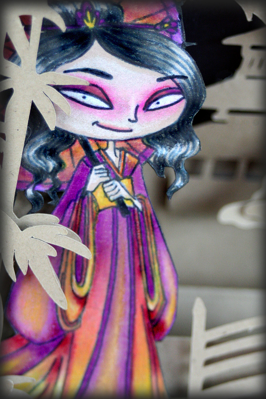
Here is the card I made for the tutorial using the Paper Tole technique. I used the lovely "Rose's Portrait" stamp from Bombshell. Following are complete instructions on how to do this technique. Mariska would have used about 4x as many layers as I did. What can I say? It's not that I'm a lazy crafter, it's just that my eyes and fingers don't function like they did when I was 20...know what I mean?


Closeup shot:

So here we go...
Paper Toling Made Easy (er)
Supplies:
1. Several copies of ONE stamped image on cardstock (I usually work with 5 to be safe).
2. Coloring medium of choice (plus a dark grey marker or pencil)
3. Detail scissors
4. Black marker (or grey or brown if you choose)
5. Hot glue
6. mouse pad (the rubbery kind)
7. Large rounded stylus--marble size (I used the handle of a piercing tool I have)

How To:

1. Choose your image. 
Just about ANY image will do.

2. Stamp your image--multiple times on cardstock.
Make certain you leave enough margin around one of the images (your base layer) if you decide to die-cut it out.

3. Decide how many layers you're gonna have.
The way I do it is to first look at my stamped image and determine which parts I want to be "lifted" off the others. Some images are easier to visualize than others...but the more you practice, the easier it gets to "see" the layers. For this tutorial, I chose "Rose's Portrait" stamp. She's perfect for "toling".  She has distinct sections of hair and accents that make it relatively easy to figure out how many layers you're gonna make. I decided on 5 layers for this project. I could have easily increased that to 7 or 8...but I stopped at 5. You can choose as many or as few layers as you wish.

4. Color the layer sections.
You may be able to use more than one section of a single image to build your layers (refer to the lower right image below). Ideally, the parts you are using should not touch/overlap. Below is an example of what parts of which image I made into layers and how I colored them.
  • Start with the bottom-most base layer--Layer 1 (lower left image). I know this looks weird, but trust me. I colored only the parts of the image that will show on that layer--a few bits of hair, her neck and her earring. The remainder of the image I colored in grey (so it doesn't show as much when you assemble it). You do the "grey" thing on ALL areas that will be underneath an overlaying layer. The grey areas help give a shadowed foundation to the subsequent layers. Theoretically...you only have to color a small margin by the edges of larger undesired areas with grey (because the middle won't show), but I colored the whole thing. You can color the grey areas with either a grey colored pencil OR a grey marker. Whatever you have. The base layer has the most grey area. All other layers only need a small amount of grey area around the adjacent margin as a foundation for the next layer (middle bottom image).
  • Layer 2..the face (middle bottom image). Notice how I colored just the face and added a small border of grey around it? The face will be silhouette-cut out along its right side and under the chin.
  • Layer 3...the front hair and shoulder (top left image). I colored just the 2 pieces of hair that I decided are on this layer. I also colored her shoulder. Both of these pieces will be silhouette-cut out (along with the grey area).
  • Layer 4...more hair (top right image). I colored the remaining sections of hair with small amounts of the shoulder and rose greyed in. Please note my mistake on this layer. The uppermost colored part of the hair has grey on the upper right corner...it shouldn't. I should have only colored that leaf that overlaps the hair in with grey...because that little section I am referring to will be cut away. Oops.
  • Layer 5...Rose and shawl (bottom right image). The final, top layer of this image is the flower adornment and the shawl. Both of which will be COMPLETELY silhouette-cut out.


 NOTE: Layers that go on TOP of other layers will be silhouette-cut out. Layers that are BEHIND other layers will have shaded areas where the overlaying layer will be.

5. Cut out the pieces. I'm talking fussy-cut here, people. You want to cut EXACTLY on the outside of the image line...no white margin left at ALL (but make sure you don't cut the black line away either).

Here is what all the pieces look like when they're cut out.

6. Coloring the edges:
This is a vital step in making it look finished. Take a black marker (or grey or brown) and color ALL cut edges of your pieces. Work with your pen facing the back side--so in case your pen slips, it will mark the back of your work not the front.
 
7. Contouring the pieces:
In this modified version of Paper Toling, I'm gonna teach you to contour your pieces...this adds a curve to them which does two things: 1) helps maintain space between layers and  2) helps hide the "unseen" parts of the underneath layer.

To contour your piece you are basically giving it a cupped shape. To do this, take one of your cut-out pieces, place it face-down on a mousepad and rub it GENTLY in circular motions with a LARGE (marble-size) stylus until the edges start to curl up a bit. I use the handle of a paper-piercing tool I have. You can use a large stylus, a marble, the rounded end of a paintbrush...ANYTHING as long as it's about the size of a marble and round and smooth.

8. Assembling the pieces:
You need to use a dimensional glue to maintain a little space between your layers. I use hot glue because it's FAST and EASY with no harmful fumes. You can also use a silicon glue like E-6000 or even silicon caulking. Yeah, I've done that--use caulking (it's a WHOLE lot cheaper than buying silicon glue). Silicon glues are also MESSY and take a lot of time to dry. Hot glue...not so much. If you choose to use a silicon-based adhesive, make sure you are in a well-ventilated area. Fumes. Bad.

Put a small "blop" of glue on the grey area of the surface, directly UNDER wherever your next layer will be. I use ONE blop of glue per layer, unless it's a really large piece...then I use a couple or three. Period. Make sure your glue blop is really a BLOP and not a SMEAR. It needs to be dimensional.  Make certain your glue blop is in the CENTER of the section...not by the edge (see image below).

GENTLY lay the next layer over your glue blop and tweak it into position. 
Press down JUST ENOUGH for the glue to touch the back of the top-most layer.

You only have to let it cool for like a minute (if you're using hot glue) before applying the next layer. It will be cooled and set then. But, if you're using silicon glue, you can continue building layers...GENTLY, CAREFULLY, until it's all assembled. Then set it aside overnight to dry. 
Whichever method of glue you choose...remember: Don't mash down your layers...you'll lose the dimensionality. That's a bad thing.
When you're finished...this is what your image will look like! Isn't it magical?


I'd like to enter this card in the following challenges:
Ingredients:
Rose's Portrait stamp - Bombshell Stamps
Nestability dies - Spellbinders (label 10, deckled oval)
Lattice edge punch - EK Success for Martha Stewart
pearl accents - Prima
Doily
patterned paper
cardstock
Prismacolor Colored Pencils
hot glue