Hi, I'm Torrey. Welcome to Left Field, where creativity runs amok and imagination is ALWAYS more important than knowledge. Shoes are not allowed but ties are optional. This is a repository of snippets from my life out here in Left Field. One never knows what shiny bits of creativity will be found here... cards, scrapbook layouts, photography, poetry, recipes, ponderings, rantings and musings. It could be anything! Life in Left Field is always changing, always real, always ...interesting.
Showing posts with label Crafter's Companion. Show all posts
Showing posts with label Crafter's Companion. Show all posts
Just popping on for a quick post for Crafter's Companion (CC)! I'm sharing a project I made with my newest set of stamps from CC. I really, REALLY like this set. There is just something magical about a big old stack of books.
I colored up the images with Spectrum Aqua Watercolor Markers. I love the time-worn feel they imparted to the books. The flourish stamp from the set blended perfectly with the background patterned paper. And, of course, I had to put a sentiment on there that reflected my sense of humor. Thank you, Julius Henry Marx, for that wonderful saying.
Oh, you don't know who that is? You probably know him by his stage name--Groucho.
Crafter's Companion products used:
Stamp set: Knowledge by Sheena (A Little Bit Magical set)
And, for today ONLY, they are having a store-wide sale...15% OFF everything! Just use the code FB415 at checkout!
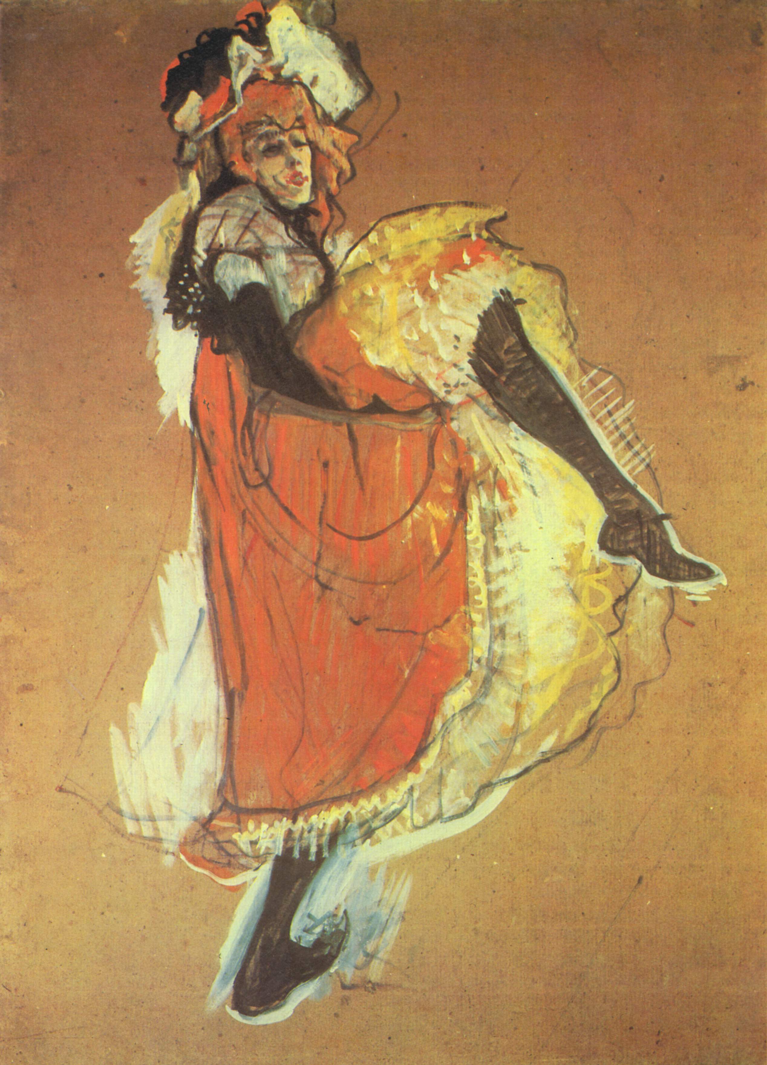
My project today is a card I made in the style of Henri Marie Raymond de
Toulouse-Lautrec...better known as Toulouse-Lautrec. He was a post-impressionist painter in
France in the late 1800s. He painted the night life in and around Paris. One of his favorite subjects was a lady named
Jane Avril. She was a can-can dancer during that time. Here is a sketch he did of Jane. Isn't she marvelous?
For my project, I used the Destinations stamp set "Hello and Goodbye". I loosely colored it with Spectrum Aqua watercolor markers to give it that painterly look. I also used the same markers to add color to the sentiment and the background matting. C'est magnifique, isn't it?
I'm here today with a lovely project for Crafter's Companion. I used a new die set along with Spectrum Aqua Watercolor Markers and Spectrum Noir Sparkle Pens to create a really lovely effect on a card.
The card went together fairly quickly! I used the Watercolor markers on some watercolor paper, then washed them with a broad, flat paintbrush dipped in water. This allows the colors to flow and blend beautifully! After it dried, I added a few additional splats of color to create more interest in the background. I arranged several lantern dies (aren't they terrific??) and then cut out the diecuts with black cardstock. I love the contrast between the black foreground objects and the colorful background. I hand-tore the background paper to size and added a stamped sentiment which I also colored with the watercolor markers. When everything was dry, I kissed the background with a clear sparkle pen here and there.
Ok, so I am not feeling blue, but my latest project for Crafter's Companion is! It's a card done in the art journal/mixed media style using several layers of various stamps and a whole lot of sparkly goodness! It's hard to tell, but the blue color was achieved with Spectrum Noir Sparkle pens. Their sparkle power is AWESOME! And (bonus) you don't get those annoying loose flecks of glitter all over yourself and your craft room!!! The glitter stays put...where it belongs...on the paper! It makes for a very elegant card that will work for MANY occasions!
I've crawled out of bed long enough to post a card for Crafter's Companion!
Yeah, I'm under the weather.
My hubby shared a wonderful little bug with me that has ravaged my lungs and sinuses. Wasn't that nice of him?
I guess he really believes in that adage "Misery loves company".
It makes me wish he'd believe in adages like, "Sharing is caring...but it does not mean giving your wife the 'crud'."
Sigh
This, too, shall pass.
So here is how the idea for this card evolved...
I was sitting in bed hacking, wheezing, coughing up creatures from various color lagoons...and knowing I need to intake some sort of nourishment.
Sick + nourishment = chicken soup. It's only logical.
Chicken soup = folk medicine = folk art = country = gingham + chicks
which, by chance, leads full circle back to chicks = chicken = chicken soup.
And that, dear friends, is how my mucus-addled mind works.
I love this really old patterned paper from Daisy D's. I don't have much of it left, but it always makes me happy when I see it. I've used it on SO MANY projects over the years.
This cute stamp set is from Crafter's Companion. It's one of my favorites. I have a fondness for chickens that I can't explain. They just make me happy. It's gently colored up with the new (and wonderful) Aquablend pencils. They can be subtle or bold...the choice is up to you!
Crafter's Companion supplies used:
AquaBlend pencils: Fossil grey, nutmeg - from Essential set. Beeswax, bison, cypress, wheat, sky blue - from Naturals set
Stamps - Sheena - A little bit sketchy - Chick Chick Chicken
And, to answer the question the sentiment on the card poses? Yeah, I'm OK.
I'm getting better (if I keep telling myself that it will eventually come to pass).
Thanks for coming out to Left Field. Don't worry, I wore a surgical mask the entire time I wrote this post. Sharing my card with you is one thing. Sharing a bug that could potentially ooze into the matrix of the internet and back out the screen of the person reading this just wouldn't be cool.
Hidy Ho, crafty peeps! I'm here today with a card I made featuring products from Crafter's Companion. I was hired to make a birthday project for a very sweet lady. I won't post her name here, because she might read this post, and I don't want her to know about this prematurely. I was told this lady really appreciates receiving cards. She is a connoisseur. The only direction I was given was that this lady LoVeS seashells and her style is elegant. Other than that, I was given cart-blanche to do what I wanted. This is what I came up with. It was one of those cards, that's not really a card. It's really a decorative piece...one that I had a complete mental picture of before I even started. I love when that happens...butsometimes, I DON'T like when that happens because then it can be REALLY challenging to get my project to match the image in my head. And trust me, it HAS to match!
This time, it came together very smoothly!
Side-step cards are so adaptable to ANY theme. And even though they are "technically" categorized as a card, I think they are really a piece of decor. It's all in how you decorate them. For this card, I colored up various stamped images of seashells with Spectrum Noir Blendable pencils and Gamsol. Then, I fussy-cut each one out and arranged them on all the surfaces of the card. There are 3 layers to this card. I added some other elements (I just KNEW that netted bag my Thanksgiving turkey came in would come in handy some day). It all folds flat for mailing too! Crafter's Companion products used:
There are 5 weeks in the blustery month of March, so that means I get to share 5 projects from Crafter's Companion with you!
Wanna peek into the inner workings of Torrey's decision-making process for which stamp to feature?
Just nod and say, "Why, of course!"
Well...while I was watching an episode (ok OK...several episodes) of The Big Bang Theory, I found myself drawn to the quirkiness of character Rajesh Koothrappali, which started me thinking about India. This began my thinking about various Indian iconic images (like peacocks, tigers, elephants, and paisley designs) which led me to the "A Taste of India" stamp sets where I found this glorious elephant, all bedecked in beautiful Indian garb.
Logical, no?
Just nod and say, "Why, of course!"
So, here is my project--inspired (albeit indirectly) by The Big Bang Theory.
I colored up Mr. Elephant with Spectrum Aqua markers. I love the mottled effect they created for his skin! I colored in the existing design on the background paper (which I thought looked very Indian-y) with Spectrum Sparkle markers. I also added sparkle to the elephant's headpiece and drape. Then I fussy-cut him out. I printed the sentiment banner on paper, colored it with the Spectrum Aquas and Sparkle markers and cut it out.
Here is a closeup of my coloring:
A few scattered sequins and a shimmering cardstock mat add just the right finishing touch of sparkle!
Thank you, as always, for coming on safari to the dark continent of Left Field! Stay tuned for my next project which will feature an AWESOME new product from Crafter's Companion. You're gonna love it!
I have TOTALLY fallen in love with their Spectrum Aqua watercolor markers.
They act/respond EXACTLY like watercolors (because they are watercolors)--but they are a lot cleaner. It's so much fun to paint images with them, because you never know exactly how it's going to turn out! That's the beauty (and frustration) of working with watercolors.
I've learned to just let them do whatever they're gonna do...because (let's face it), trying to control watercolors is like herding cats on unicycles.
Life is SOoooo much better when I just let them do their own thing. Besides, that painterly effect is gorgeous!
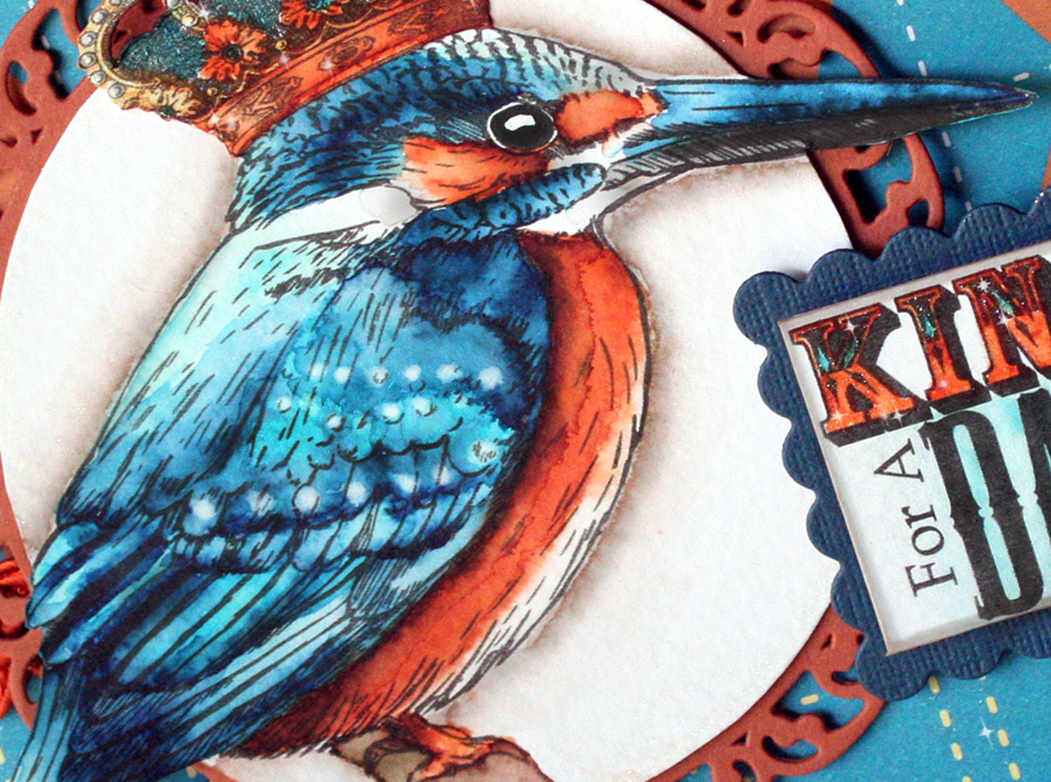
King For A Day
I used this beautiful stamp of a Kingfisher by Crafter's Companion. Let me tell you...I studied several photographs of Kingfishers for a very LONG time. They are complex little birds when it comes to the coloring of their plumage. They have these rows of little light blue dots on their wings, a light blue stripe down their backs, and the cutest, stubbiest little tails!
To simulate the dots, I did a color wash over the entire wing, then actually pulled paint off the paper by wetting my brush...dabbing it on the paper and immediately blotting it with paper towel--over and over and over again and again and again until the pigment pulled out of the paper fiber.
That is one thing I love about working with watercolor. If you make a mistake, you just use that method I just described to effectively "erase" the errant paint.
Here is a closeup of my painting detail.
I think I'm getting pretty darn good with these wonderful markers!!! I know I'm having a ball with them! I've always admired and wanted to be a watercolor artist. With these markers, I think I can be!
I'm trying to make things other than just cards...although cards are still my go-to thing to make when I'm gettin' all crafty. But today, I made a cute little gifty thing. And trust me, it would make an absolutely adorable last-minute gift when you're simply at a loss as to what to get someone.
I made a little tea bag gift box, of sorts.
I say "of sorts" because when it comes down to it...it's not REALLY a box.
It's an accordion folder. You know...like the ones to organize paperwork in.
But this one is TINY.
And, while we're on that subject...why is it that everything, when shrunk down to a tiny size, is cute?
I mean...EVERYTHING.
Even things like: hammers, cars, boxes, Pit Bulls, garbage cans, and even (yes) accordion file folders become absolutely cute as a proverbial bug's ear when they are diminutive versions of the original.
My version holds individually-wrapped tea bags...but you could put other things in it too...recipes, business cards, trading cards, ATCs (oooh that's a great idea), even packets of Kool Aid.
It measures roughly 3.5" x 5" (that's approx. 9cm x 13cm for those into metric measurements)...so basically, it's the size of a standard index card. The beauty of this project is that the size can be adjusted up or down...it all depends on the size of envelopes you make/use to create the pockets.
I used a cute image and sentiment stamp from Moonbeam Meadows. I colored it up with my Spectrum Aqua markers. This was the most time-consuming part of this project.
I made the scalloped mat and lid edging (which I now realize, by looking at the photo above, got accidentally tucked under the image on the top left corner--oh well, I'm not doing a photo re-shoot). I obtained the correct size/length by strategically cutting apart and splicing a scalloped rectangle die-cut shape.
To open it up, you untie the bow and lift up the "lid".
This is what the inside looks like. The bags of tea fit nicely in the accordion folds! 2 tea bags will fit comfortably in each section...so that means it will hold 12 tea bags!!
I'm not posting a tutorial on this (I know you're disappointed)...but it's because there is an excellent tutorial available on "The Ultimate Advanced Construction Techniques" DVD available from Crafter's Companion! These little gems are SO easy peasy to make. I used my Ultimate Tool (by Crafter's Companion) to make it...but you don't have to own an Ultimate Tool to make them...it just makes it easier to follow along with the DVD.
It's a VERY easy project. I mean like stupid easy. So don't be intimidated.
I think it only took me about 20 minutes to make one from start to
finish (not counting coloring the image)...and I'm slow as molasses. I admit it...I dawdled. I have a good
excuse though...I was watching "The Big Bang Theory" while I was
crafting.
I LoVe that show. The character Sheldon cracks me up.
I don't wanna hear any whining about "Oh, that looks so hard, I'd never be able to make that." If I hadn't been distracted by the erudite antics of Dr. Sheldon Cooper, I probably could have made the accordion file (without the image on the front) in about 7.5 minutes...give or take 30 seconds.
Supplies:
Each item is a link to the product at Crafter's Companion website for your shopping convenience!
Today's card is sort of an outside-in card. The image is on the INSIDE. But, I gave a teasing little glimpse of what lies inside with my porthole feature! This is my twisted take on a "Bon Voyage" card...sort of the opposite end of the journey; the coming home part.
WELCOME HOME
The outside of the card is all paper-pieced by hand...porthole, ship's siding, suitcases...the whole shebang. I used Crafter's Companion shimmering cardstock for the porthole and the hardware on the suitcases, and Spectrum Noir Blendable Pencils to add definition to the porthole, the suitcases, and travel stickers.
The inside of the card features a fussy-cut Statue of Liberty sitting atop a stamped skyline background. I added the "sun" rays by coloring through a stencil directly on the background with colored pencils. Crafter's Companion products used:
I'm here today with another fun project for Crafter's Companion. Today I'm offering up a small collection, a scattering if you will, of ATCs. For those of you who haven't a clue what an ATC is...ATC stands for Artist Trading Card. It's a mini, ORIGINAL piece of art that measures 2.5" x 3.5". Basically, it's roughly the size of a business card.
They are the artsy-fartsy version of a baseball trading card. They are meant to be traded between artists--given and received--and collected--and loved. They originated in Switzerland in the mid 1990s, and have skyrocketed in popularity over the last 20 years. They can be made using just about any medium--paint, pencil, pen, ink, mixed media, fabric, metal, wood, plastic, polymer clay--as long as they are flat(ish) and measure 2.5" x 3.5" (64mm x 89mm). They are SUPPOSED to be able to fit in a standard trading card sleeve. Though, some of mine have been a little more dimensional in the past.
Here is my little trio:
I started by embossing a piece of watercolor paper with an embossing folder. I created a Letterpress effect...to do this, just ink up the raised surface of an embossing folder (I brayered on the ink), then emboss the paper as usual. This creates a Letterpress look with a debossed image that is inked. Then I did a watercolor "wash" background over the debossed area with my Spectrum Aqua markers. I scribbled the marker randomly over the paper and used a large flat brush and some water to move the ink around to create a painterly effect.
On a separate piece of watercolor paper, I stamped the images, watercolored them with my Spectrum Aqua markers, then cut them out. I'm having some difficulty doing really fine detail stuff right now, so my cutting was not-so fussy for this project. As most of you know, I am METICULOUS when it comes to cutting stuff out. I leave NO WHITE showing around an image. But today...not so much. It was a lesson in acceptance for me, that's for sure. For the sentiments...I did a color wash on the paper and let it dry BEFORE I stamped the sentiment...this ensured a crisp, clean stamping without running.
I finished them off by using my Spectrum Noir Sparkle pen to add glimmer to various elements of the cards (yeah, I know...it doesn't show up in the photograph...but trust me, there is all sorts of sparkly goodness on there). I added the finishing touches of white dots with a paint pen.
I'm S L O W L Y getting back in to the crafty swing of things after my recent run-in with "the crud". SLOWLY.
Today I have a project I created for Crafter's Companion. I am taking a BRIEF departure from doing cards, and created a piece of art for the wall in my studio. It measures 8"x10".
It's to remind me that "change" is not a bad thing.
It's actually, necessary.
For today's project, I started with a digital stamp image from the "Flights of Fantasy" CD collection. This CD is a compilation of lovely fairy-esque art by Morgan Fitzsimons. They're all lovely.
I like fairies.
A LOT.
Choosing just one from this CD proved to be tough.
I colored up the image with Spectrum Noir Blendable Colored Pencils. Then, I cut out the image and proceeded to Zen-Tangle a background for it (with a mircrofine-tip Sharpie, because my Sakura Pigma pens have gone missing). When the Tangling was finished, I shaded it all with a plain old #2 pencil and a blending stub. It's AMAZING what a difference a little smudgy shading does to really bring a Tangled piece to life.
After I was finished tangling...I cut out an aperture in the background and mounted the stamped image in the opening. I colored additional butterflies and popped them off the page with foam tape.
This is the first time I've Zen-tangled (Zen-Doodled) in about 2 years. So, I was a bit rusty at first. But, it amazed me at how quickly it all came back to me. It's like riding a bike.
Well, I don't know about you, but when I think of fun things about winter....skiing, sledding, snowball fighting, ice skating, caroling...they all end up with the participant of said activities being chilled to the bone! And this, to me, isn't so much fun after awhile.
MY IDEA of winter fun is hot cocoa.
With Marshmallows.
Hot cocoa just SCREAMS "winter" to me. Actually, at my house, we have hot cocoa available all year-round, so basically...it's screaming at me. ALL. THE. TIME... (in a soft, warm, chocolate-y voice).
Here is my take on our current wintry theme! Our mice friends certainly seem to be enjoying this winter-time treat! I used two "oldie but goodie" stamps and colored them up with my Spectrum Aqua pens. Have I mentioned how much I just LOVE these pens? They may turn me into a watercolor artist...you never know!
Ingredients:
"Warm Cup" stamp by House Mouse
"Sugar Crash" stamp by House Mouse
Spectrum Aqua pens (Crafter's Companion) in following colors: Aquamarine, Peach, Spice, Slate, Desert, Burgundy, Charcoal, Chocolate.
Stately Circles dies (Spellbinder's)
Loopy edge punch (Martha Stewart)
Ribbon
Patterned paper
Cardstock
Distress Ink (Tim Holtz)- Vintage Photo
We have one generous sponsor this time around...
They are offering a random assortment of their Premium Dye ink pads!
One of my crafty friends, Rosemary, recently posted a video on a cool aperture card technique. Only problem was, the video is either in Chinese or Japanese. All the captions are in Kanji...and the measurements were in Metric. But, otherwise, it was a pretty good video--enough so that I felt I could figure it all out.
So, I told my friend, "Give me a day, and I'll have this all figured out with step shots, measurements and templates!"
And, guess what?
I actually did it!
So, for my latest project for Crafter's Companion, I present the Heart Aperture Card with full tutorial!!
The way the card works, is that the card is a gate-fold card with a belly band. When you open it, the inside reveals a closed heart-shaped aperture that magically opens up to reveal the image underneath. It's really cool.
Here is the short version of the original video:
Here is my version. I used double-sided patterned cardstock.
1. This card uses 5 pieces for the basic card construction. Here are the pieces with their measurements, IN INCHES...because I'm American. Dotted lines indicate fold lines.
Piece A (Card base) = size: 4.75" x 9.5" (4-3/4 x 9-1/2). Fold at 2-3/8" from each end to create a gate-fold base.
Piece B (Window aperture) = 3.25" x 7" (3-1/4 x 7). Fold in half. Fold tabs on either end at 3/8".
Piece C (Window) = 3.5" x 5.5" (3-1/2 x 5-1/2). Fold tabs on top and bottom at 3/8".
Piece D (Heart) = 3-1/8" x 3-1/8". Fold in half.
Piece E (Belly Band) = 1" x 10". Folded around final card to overlap slightly in middle of card front.
2. Cut out all your pieces out of cardstock. I used double-sided patterned cardstock. It's WAY easier that way. For the remaining step shots, I have labeled each photo with the corresponding piece letter, so you know what piece you're working on.
3. Starting with PIECE A...Score and fold sides in to middle as shown at 2-3/8" from each end. Set aside.
4. Take PIECE D and fold it in half. With a pencil, draw half a heart shape, on the fold as shown. The size should be about 1/4" from top, bottom, and side as shown:
5. Cut out heart along line.
You'll end up with something that looks like this:
You'll need the heart-shaped piece to use as a template for the other parts of your card.
6.Take PIECE B and fold it in half. Crease the fold well.
7. Fold the heart template piece in half and position its straight edge on the fold of PIECE B as shown below, leaving equal margin top and bottom. Trace around heart half with pencil.
8. Cut along pencil line through both layers of folded PIECE B to create heart-shaped opening in the middle of PIECE B. This will give you a second heart-shaped piece to use.
9. Cut PIECE B in half as shown below. Set them aside for now.
10. On PIECE C, fold tabs on both ends in and crease well. NOTE: The tabs are on the TOP AND BOTTOM of Piece C.
11. On BACK SIDE of PIECE C (in my case, the peach side), Draw line down the middle (at 1-3/4" in from side) LIGHTLY with pencil. Take heart-shaped template (from either PIECE D or PIECE B) and position it on PIECE C so it's in the center of PIECE C. Draw heart, with pencil, using template. Carefully cut out heart window, Use a craft knife if you can. NOTE: I cut my window slightly larger (like 1/16") than the pencil mark so that the aperture would show underneath as an outline to the image when fully open.
12. Put strip of strong adhesive (like Score tape, red tape, Sookwang tape) on FRONT side of each tab.
13. Adhere PIECE C to inside of card base (PIECE A), being careful to center it between folds.
14. Carefully position and adhere colored image behind PIECE C to card base. Make sure image is smaller than outside dimension of PIECE C.
15. Adhere little tabs out of same cardstock (like 1/2" long max) at top and bottom of left half only of PIECE B. Make sure they don't extend into the aperture opening. These will allow the right half to smoothly slide over the left half when card opens and closes.
16.Fold 3/8" tabs under on each end as shown below. Crease well. Apply strong tape to front side of each tab (second photo)
17. CAREFULLY slide left and right halves of PIECE B UNDER PIECE C as shown. Align both halves of PIECE B's aperture with window on PIECE C. Adhere tabs of PIECE B halves to card base (PIECE A)...so they are equal distance from the folds on either side. Position RIGHT half of PIECE B so that it glides OVER the LEFT half. You can manipulate them once they're adhered. NOTE: You may need to tweak these halves a bit so that the card opens and closes smoothly. If you measured and cut precisely, you shouldn't have any problems. Mine was a bit sticky on one side, so I trimmed the edge of PIECE C down a bit so that it didn't bind with PIECE B. Apparently, I was measuring challenged today.
18. Close card and position Heart Template (from PIECE D) so that it is centered on front (PIECE A). Trace around heart on closed card front with pencil.
19. Cut each half of heart from front panels of PIECE A.
20. To make the belly band, take PIECE E and wrap it around closed card so that ends meet in middle of front of card. The ends should overlap slightly. Remove from card and crease folds well. Glue overlapped ends and adhere one of your heart templates (either from PIECE D or PIECE B) to the front of the belly band to hide the joined ends.
NOTE: you can trim down the heart so that it is about 1/4" smaller than than the aperture to create a different effect. Slide the belly band back on your card, and GUESS WHAT? Put a fork in you, YOU'RE DONE! Well, you're finished with the CONSTRUCTION of it. Now comes the FUN part! You get to decorate it however you choose!
Finished product
Thank you SO much for wading through this tutorial with me! I hope it made sense. Please let me know if I've left anything out or if you are confused about something. I'd love to see what y'all come up with!
I'm entering this card in the following challenges: