Hi, I'm Torrey. Welcome to Left Field, where creativity runs amok and imagination is ALWAYS more important than knowledge. Shoes are not allowed but ties are optional. This is a repository of snippets from my life out here in Left Field. One never knows what shiny bits of creativity will be found here... cards, scrapbook layouts, photography, poetry, recipes, ponderings, rantings and musings. It could be anything! Life in Left Field is always changing, always real, always ...interesting.
Showing posts with label Spectrum Noir Sparkle. Show all posts

April 5, 2016

Feeling Blue

Hidy ho, crafty peeps!

Ok, so I am not feeling blue, but my latest project for Crafter's Companion is! It's a card done in the art journal/mixed media style using several layers of various stamps and a whole lot of sparkly goodness! It's hard to tell, but the blue color was achieved with Spectrum Noir Sparkle pens. Their sparkle power is AWESOME! And (bonus) you don't get those annoying loose flecks of glitter all over yourself and your craft room!!! The glitter stays put...where it belongs...on the paper! It makes for a very elegant card that will work for MANY occasions!


Crafter's Companion products used:
Thanks for journeying out to Left field!


March 10, 2016

Big Bang Namaste

Namaste, crafty peeps!

There are 5 weeks in the blustery month of March, so that means I get to share 5 projects from Crafter's Companion with you!

Wanna peek into the inner workings of Torrey's decision-making process for which stamp to feature?

Just nod and say, "Why, of course!"

Well...while I was watching an episode (ok OK...several episodes) of The Big Bang Theory, I found myself drawn to the quirkiness of character Rajesh Koothrappali, which started me thinking about India. This began my thinking about various Indian iconic images (like peacocks, tigers, elephants, and paisley designs) which led me to the "A Taste of India" stamp sets where I found this glorious elephant, all bedecked in beautiful Indian garb.

Logical, no?

Just nod and say, "Why, of course!"

So, here is my project--inspired (albeit indirectly) by The Big Bang Theory.
I colored up Mr. Elephant with Spectrum Aqua markers. I love the mottled effect they created for his skin! I colored in the existing design on the background paper (which I thought looked very Indian-y) with Spectrum Sparkle markers. I also added sparkle to the elephant's headpiece and drape. Then I fussy-cut him out. I printed the sentiment banner on paper, colored it with the Spectrum Aquas and Sparkle markers and cut it out.

Here is a closeup of my coloring:

A few scattered sequins and a shimmering cardstock mat add just the right finishing touch of sparkle!

Crafter's Companion products used:

Thank you, as always, for coming on safari to the dark continent of Left Field! Stay tuned for my next project which will feature an AWESOME new product from Crafter's Companion. You're gonna love it!


March 7, 2016

King for a Day

Hidy Ho, crafty peeps!

I'm here today with a project for Crafter's Companion.

I have TOTALLY fallen in love with their Spectrum Aqua watercolor markers.

They act/respond EXACTLY like watercolors (because they are watercolors)--but they are a lot cleaner. It's so much fun to paint images with them, because you never know exactly how it's going to turn out! That's the beauty (and frustration) of working with watercolors.

I've learned to just let them do whatever they're gonna do...because (let's face it), trying to control watercolors is like herding cats on unicycles.

Life is SOoooo much better when I just let them do their own thing. Besides, that painterly effect is gorgeous!

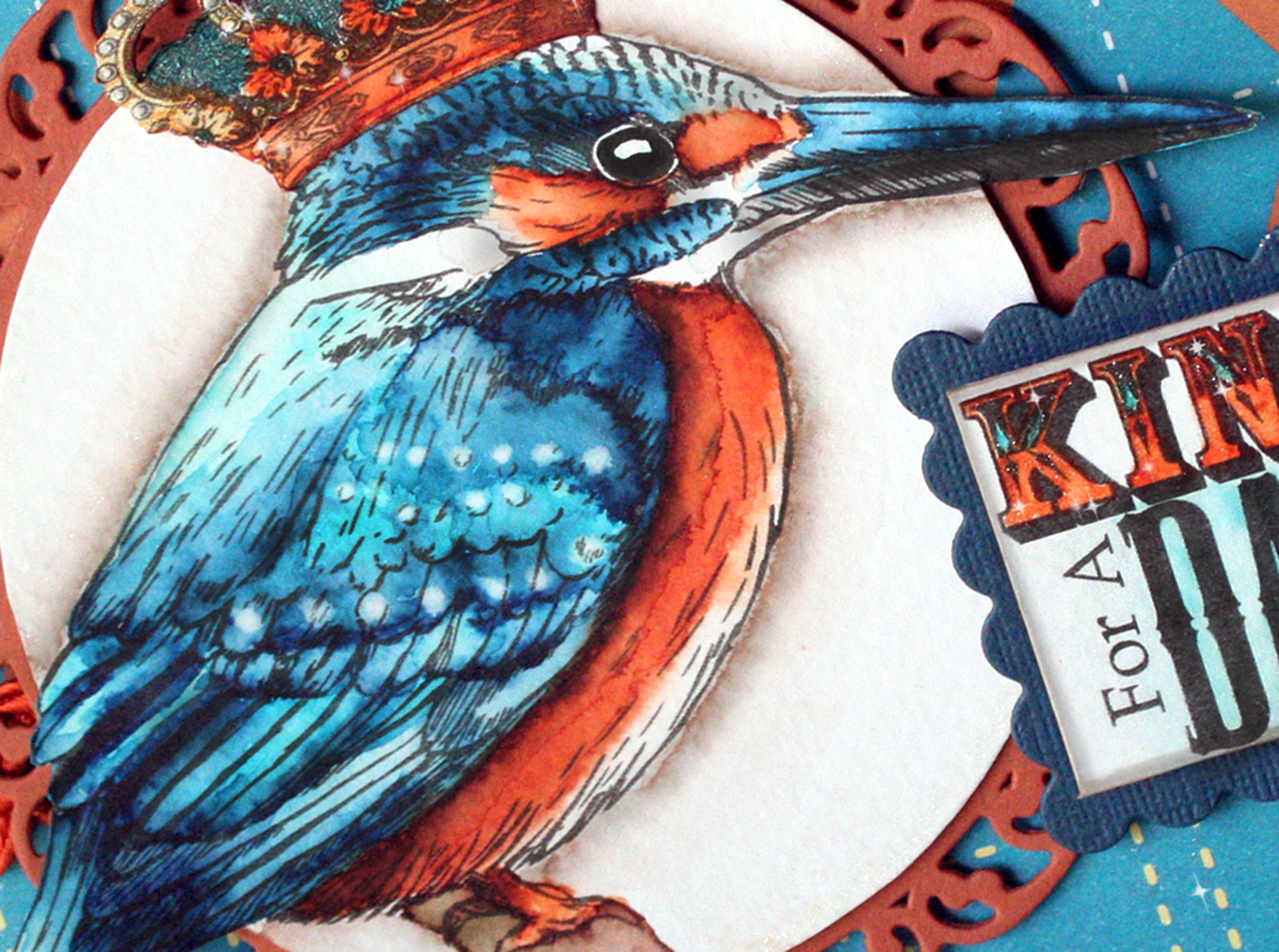
King For A Day
I used this beautiful stamp of a Kingfisher by Crafter's Companion. Let me tell you...I studied several photographs of Kingfishers for a very LONG time. They are complex little birds when it comes to the coloring of their plumage. They have these rows of little light blue dots on their wings, a light blue stripe down their backs, and the cutest, stubbiest little tails!
 
To simulate the dots, I did a color wash over the entire wing, then actually pulled paint off the paper by wetting my brush...dabbing it on the paper and immediately blotting it with paper towel--over and over and over again and again and again until the pigment pulled out of the paper fiber.

That is one thing I love about working with watercolor. If you make a mistake, you just use that method I just described to effectively "erase" the errant paint.

Here is a closeup of my painting detail.
I think I'm getting pretty darn good with these wonderful markers!!! I know I'm having a ball with them! I've always admired and wanted to be a watercolor artist. With these markers, I think I can be!

Crafter's Companion products used:
Thank you for finding your way over here to Left Field! Come back ANYTIME...I'd say the door is always open...but there are no doors here!

February 15, 2016

Trading Up

Hidy Ho, crafty peeps!

I'm here today with another fun project for Crafter's Companion. Today I'm offering up a small collection, a scattering if you will, of ATCs. For those of you who haven't a clue what an ATC is...ATC stands for Artist Trading Card. It's a mini, ORIGINAL piece of art that measures 2.5" x 3.5". Basically, it's roughly the size of a business card.

They are the artsy-fartsy version of a baseball trading card. They are meant to be traded between artists--given and received--and collected--and loved. They originated in Switzerland in the mid 1990s, and have skyrocketed in popularity over the last 20 years. They can be made using just about any medium--paint, pencil, pen, ink, mixed media, fabric, metal, wood, plastic, polymer clay--as long as they are flat(ish) and measure 2.5" x 3.5" (64mm x 89mm). They are SUPPOSED to be able to fit in a standard trading card sleeve. Though, some of mine have been a little more dimensional in the past.

Here is my little trio:

I started by embossing a piece of watercolor paper with an embossing folder. I created a Letterpress effect...to do this, just ink up the raised surface of an embossing folder (I brayered on the ink), then emboss the paper as usual. This creates a Letterpress look with a debossed image that is inked. Then I did a watercolor "wash" background over the debossed area with my Spectrum Aqua markers. I scribbled the marker randomly over the paper and used a large flat brush and some water to move the ink around to create a painterly effect.

On a separate piece of watercolor paper, I stamped the images, watercolored them with my Spectrum Aqua markers, then cut them out. I'm having some difficulty doing really fine detail stuff right now, so my cutting was not-so fussy for this project. As most of you know, I am METICULOUS when it comes to cutting stuff out. I leave NO WHITE showing around an image. But today...not so much. It was a lesson in acceptance for me, that's for sure. For the sentiments...I did a color wash on the paper and let it dry BEFORE I stamped the sentiment...this ensured a crisp, clean stamping without running.

I finished them off by using my Spectrum Noir Sparkle pen to add glimmer to various elements of the cards (yeah, I know...it doesn't show up in the photograph...but trust me, there is all sorts of sparkly goodness on there). I added the finishing touches of white dots with a paint pen.

Ingredients:
Crafter's Companion products used:
Other supplies:
  • Memento ink-Tuxedo Black (Tsukineko)
  • White paint pen (Sakura) 
Thanks, as always, for journeying out to visit me here in Left Field!


February 7, 2016

Tangled Change

Hidy Ho, crafty peeps!

I'm S L O W L Y getting back in to the crafty swing of things after my recent run-in with "the crud". SLOWLY.

Today I have a project I created for Crafter's Companion. I am taking a BRIEF departure from doing cards, and created a piece of art for the wall in my studio. It measures 8"x10".

It's to remind me that "change" is not a bad thing.

It's actually, necessary.

For today's project, I started with a digital stamp image from the "Flights of Fantasy" CD collection. This CD is a compilation of lovely fairy-esque art by Morgan Fitzsimons. They're all lovely.

I like fairies.

A LOT.

Choosing just one from this CD proved to be tough.


I colored up the image with Spectrum Noir Blendable Colored Pencils. Then, I cut out the image and proceeded to Zen-Tangle a background for it (with a mircrofine-tip Sharpie, because my Sakura Pigma pens have gone missing). When the Tangling was finished, I shaded it all with a plain old #2 pencil and a blending stub. It's AMAZING what a difference a little smudgy shading does to really bring a Tangled piece to life.

After I was finished tangling...I cut out an aperture in the background and mounted the stamped image in the opening. I colored additional butterflies and popped them off the page with foam tape.

This is the first time I've Zen-tangled (Zen-Doodled) in about 2 years. So, I was a bit rusty at first. But, it amazed me at how quickly it all came back to me. It's like riding a bike.

I forgot how much I like Tangling.

Supplies used:
Thanks, as always, for tromping out here to visit me in Left Field!

December 19, 2015

Shake-it-up, Santa!

Hidy Ho Ho Ho, crafty peeps!

Well, I got all the gifts wrapped!

Yay, me!!!

But, I must admit...by the time I got to the last one...it got REALLY sloppy. Heck, by the end, I wasn't even searching for boxes that would fit. I just wrapped the gift itself, no matter how irregularly-shaped it was.

I like to call it..Free-form wrapping: Unburdened by the box!

I also got my Christmas cards out.

Jonathan and I made Christmas cards this year. It was a 5-day process.

I kid you not.

I had a rough idea of how they would look...a "basic" idea. But, you know me, as we worked on them their design kept evolving. I could NOT have done this without Jonathan's help. He's quite the sous crafter! (that's like a sous chef--only without the hat). He's pretty handy with the adhesive gun now!

I finally got to the point where I just shoved them in the envelopes and called them done.

I ordered up some really cute stamps and dies from Lawn Fawn especially for our cards this year.

Here is the outside of the cards we made. Pretty unassuming, isn't it? White on white embossing with a little cut-out character in the lower right corner and a simple stamped sentiment.

But, open it up and it's a whole other story.

Wait for it....
We made little snow-shaker ornaments! They slide out from under the ribbon so they can be hung on a tree. You can't tell, but I used my new Spectrum Noir Sparkle pens on the "Let it Snow" sentiment. They really are the EASIEST way to add sparkle to your projects.

We did the cards in one of 3 different colors: lime, turquoise, red.

We used LOTS of different embossing folders for the inside background. And each ornament is unique! No duplicates! I colored all the images with my trusty Prismacolor pencils.

 On the back of each ornament, we stamped a sentiment, added a date, and signed our names. It's all sparkly too...though you can't tell. Then, we added a little removable tag that lets everyone know they are actually ornaments that can be removed from the card.

Here are most of the ornaments hung on a little tree!

We had fun...but they took F O R E V E R to make! I'm not sure my studio is going to recover any time soon! It's Christmas craft Armageddon in here right now...like a nuclear bomb hit Santa's workshop.


We were only able to make 25 of these little gems. We didn't have time or funds to make and send more, so, I apologize if we didn't send you one this year. It doesn't mean we don't love you. Not at all! Next year, we're starting in October, so we can make them for EVERYONE!

Ingredients:
These cards were handmade, with love, by those two folks listed above.

I'd like to enter this in the following challenge(s):